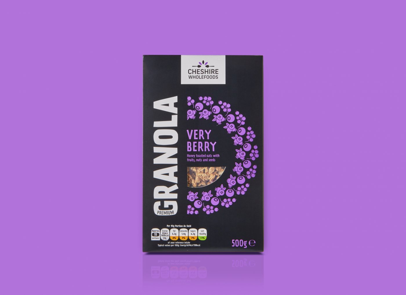
Healthy and wholesome cereal branding and packaging
| Client | Cheshire Wholefoods |
|---|---|
| Requirement | Branding, Creative Design |
As self-confessed cereal addicts we were delighted to be asked to design the branding and packaging for the new Cheshire Wholefoods brand. Breakfast, lunchtime, evening snacks, we love a good cereal whatever time of day so we were delighted to be given this scrumptious challenge.

Cheshire Wholefoods is an exciting new brand to enter the cereal market. As well as developing their new brand identity we were tasked to design their cereal packs for their first ranges of products. Their granola and muesli are wholesome products for consumers who have and desire a healthy lifestyle. Their muesli is a delicious blend of wholegrain cereals, fruit, nuts and seeds and their granola is made from delightful honey roasted oats.


The premium range of muesli and granola packs we designed have a simple, beautiful and elegant style. The illustrations for each carton help create a highly desirable and distinctive range. As well as showing the product, the grain shaped aperture on the front of pack evokes naturalness. Fresh and wholesome the packs have a simple country inspired, artisanal design which combines the sophistication of the black background with crafted colours for each product.


Before embarking on the pack designs themselves we also created the brand identity of Cheshire Wholefoods. We designed a flexible identity that can change with each pack as the product range evolves for both the UK and export markets.

The logo mark itself takes inspiration from nature, the countryside and the proud farming heritage of Cheshire. It plays homage to the flag of Cheshire and combines three cereal grains with spoons to help show the story of farm to table.

